
Saturday, April 14, 2007

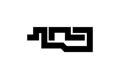
After spending few weeks trying to come up with a concept and identity for ahn, at last i managed to came up with something that could satisfy myself. I spent a lot of time back and forth trying plenty of different designs, typography, concepts and styles wasting much time achieving nothing. Maybe cause i wanted everything to be perfect, I kept finding faults and mistakes with my every design i came up with. I really hope i would look back in 3 months time and think why the hell did i choose this... as for now, enjoy and take it easy on my design. :)

Photo Sharing and Video Hosting at Photobucket

I think i better explain my concept for this logo, i don't want my past weeks of hard thought to go to waste with people thinking its just another logo design. The concept of AHN is all about the finger that does the designing of work etc. ( read the 1st post and you'll know ) I decided to use solid black thick lines to give my logo a 'shoutout' impression. The visual representation is that of a finger + mouse using 2 separate lines forming the image. Actually it's quite hard to explain exactly, just hope you guys get the idea. Hm... that's about it i guess. Peace out.

No comments: